Modern Family Restaurant Design Practice
#UI/UX Design #Graphic Design #Figma
Overview
As part of an online course, I developed a prototype for a digital menu for a “modern” restaurant. This “Modern Family Restaurant”, no relation to the TV show, would be geared towards the kinds of families looking for a menu that’s consistently healthy, for a menu that caters to a variety of dietary needs, for a dining experience that caters towards introverts, or for a quiet and efficient family dinner. Rather than a lot of hands on waiters, all of the ordering would be facilitated through the tablet but with a button for help would always be available.
In App Screens
Initial page upon seating
Acknowledgement whenever help button is pushed
Order confirmation page w/arcade & menu options
Prototype for a kids arcade mode
Left: Side panel for detailed information on selected dish
Right: Side panel for that shows the order total
Design
For this prototype I built the pages necessary to place an order as well as a help page and an arcade page. As shown below I also used Figma to prototype it into a functional clickable menu.
The card for the dish preview was created as a component with each different dish being an different instance. Without an actual menu, it didn’t seem necessary to create different pages for the detailed view of the dish or a functional version of the menu summary.
As a non-Mac user, I was limited to Adobe XD and Figma and ended up choosing Figma as it was different from other softwares I had tried.
Figma Prototype’s Flow Pattern
Inspiration
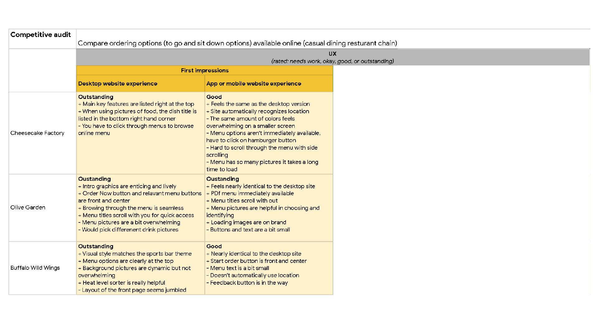
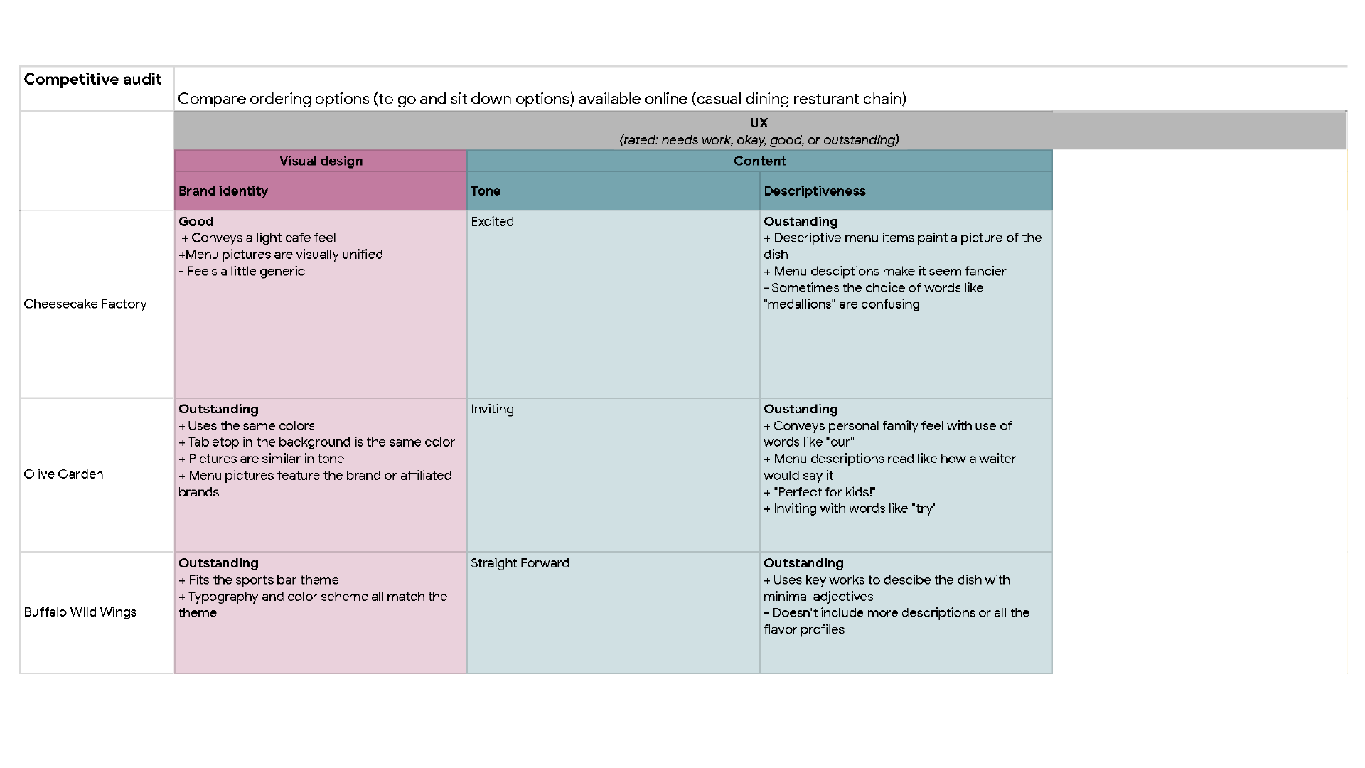
I took inspiration from restaurants menus that read as either healthy or family friendly and I found that menus of Calif Chicken Café and Olive Garden matched that. I also looked at more retro menus and was inspired by Magnolia Table’s menu. Thinking about farm-to-table restaurants, I looked for more earthy tones for the color palate. For the typefaces I took heavy inspiration from Magnolia Table’s menu and found the combination of the three fonts (Baron Neue, Sanchez, and Homemade Apple) fit the idea of a “modern” “family” “restaurant”.
Potential Users
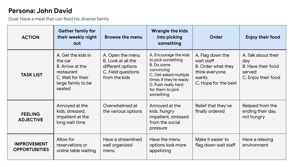
As part of the course, I created user personas, user stories, and a storyboard for five different families, trying to imagine different families that would come to this kind of restaurant. Not all the ideas from these imagined users made it into the final piece so future iterations would work towards adding in these additional features.


![Google UX Design Certificate - User Story [Template] (3).png](https://images.squarespace-cdn.com/content/v1/5af1f2b0f2e6b1f46cc11423/1663395482466-RNRVWEYI1CJZ9C002GVP/Google+UX+Design+Certificate+-+User+Story+%5BTemplate%5D+%283%29.png)
![Google UX Design Certificate - User Story [Template] (4).png](https://images.squarespace-cdn.com/content/v1/5af1f2b0f2e6b1f46cc11423/1663395482455-QF5YE5KPH3SSLJ3DU2SK/Google+UX+Design+Certificate+-+User+Story+%5BTemplate%5D+%284%29.png)


![UX Design Certificate - Storyboard [Big Picture].png](https://images.squarespace-cdn.com/content/v1/5af1f2b0f2e6b1f46cc11423/1664757438001-DKOVDQVDCOMZVMJROHQX/UX+Design+Certificate+-+Storyboard+%5BBig+Picture%5D.png)
![UX Design Certificate - Storyboard [Close Up].png](https://images.squarespace-cdn.com/content/v1/5af1f2b0f2e6b1f46cc11423/1664757438001-EYIDU9ZSTP1F5PKZ2YV7/UX+Design+Certificate+-+Storyboard+%5BClose+Up%5D.png)
Potential Research Study Plan


Competitive Audit Report


